This is a feature that I personally wanted for my design needs – and it is incredibly fun. You’ll have this feature as part of your huge 2015 Fundy Designer update – which is free for all users. The update will be coming mid-March.
Align Top and Bottom in a Drop Zone
Previously you could only align Drop Zones, but aligning a Drop Zone to get the images where you want was tricky. Now, you’ll be able to align images within the Drop Zone with ease.
BEFORE
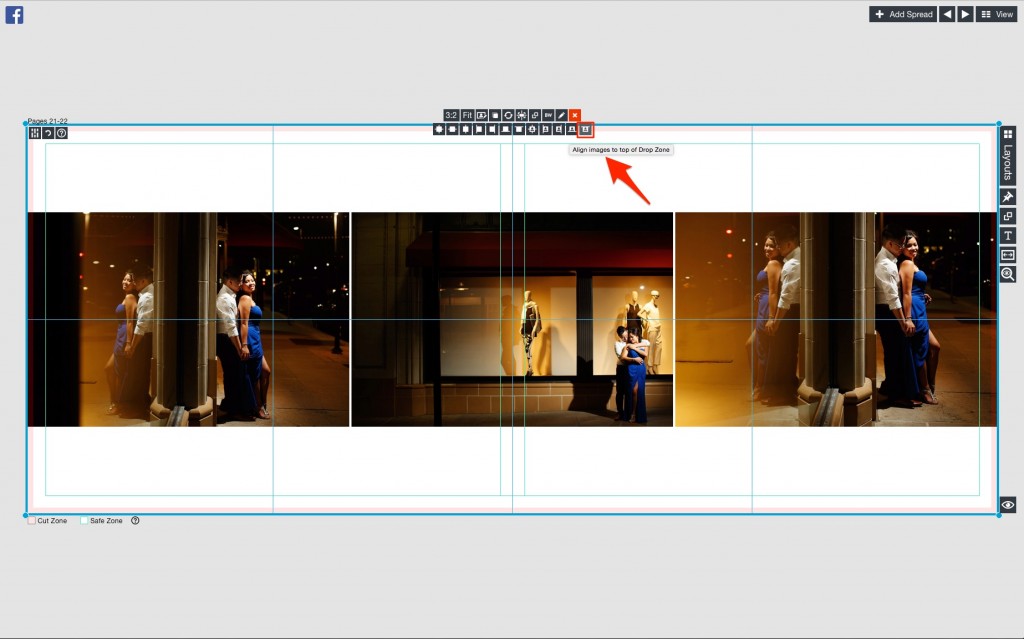
Just click on the alignment button and choose the icon for “Align images to top of Drop Zone.”
After
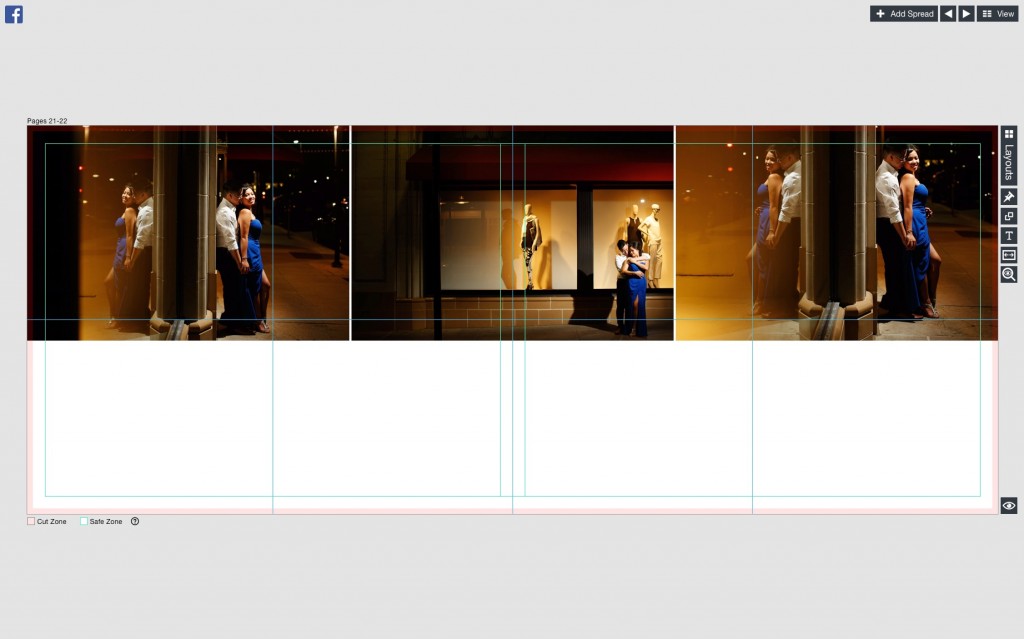
You’ll see this used a lot in our new Signing Book designs, which is part of this release. This feature allows for a large amount of negative space for signing books.
Align Left and Right
This is a design that you’ll see Jerry Ghionis use a lot in his albums. Basically it’s a vertical on the left and a vertical on the right. I simply drop in two vertical images and make a Drop Zone fill each side of the page.
Before
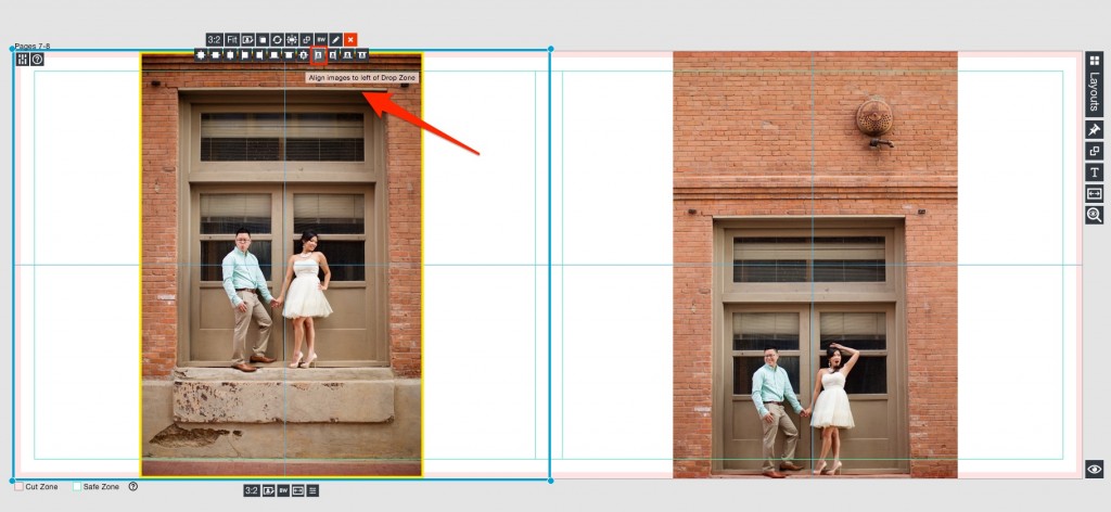
Note that I choose the Align left icon on the left side and the align right icon on the right.
After
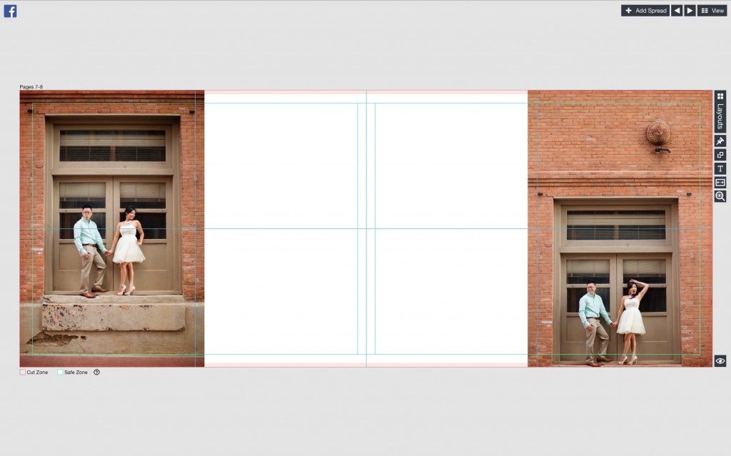
Now I have this beautiful design. This feature provides a one-click solution to a difficult design, and we know you are going to love it.
Stay tuned for the free mid-March release.
