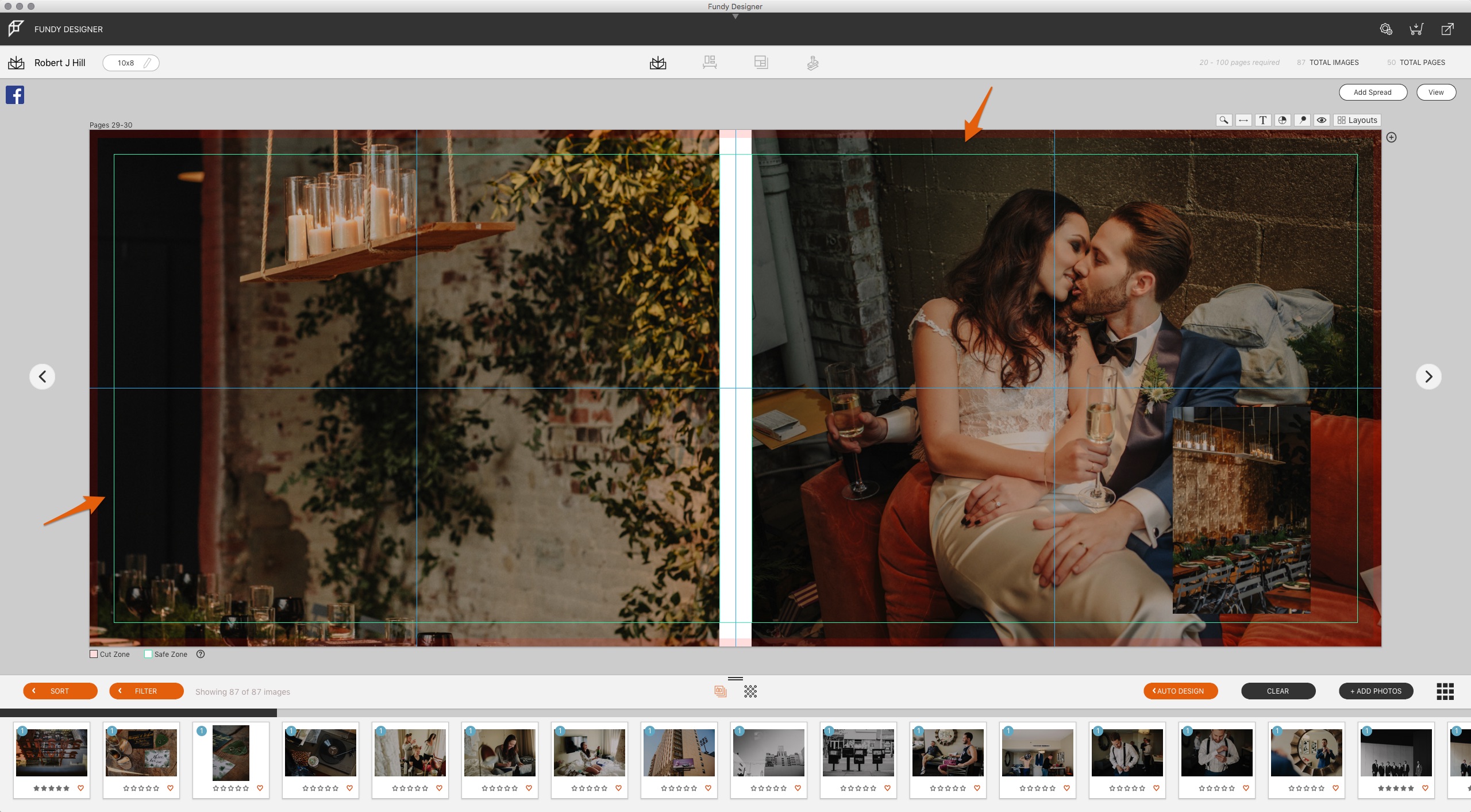
As we all know, being a photographer means wearing many different hats. When you do put on that designer hat during the album design process, it can be easy to start over analyzing the design and miss some of the smaller details. We’ve collected a few of the most common album design mistakes we notice, all of which can place your albums at a disadvantage and affect your confidence with in-person sales. Are you already avoiding these three design mistakes?
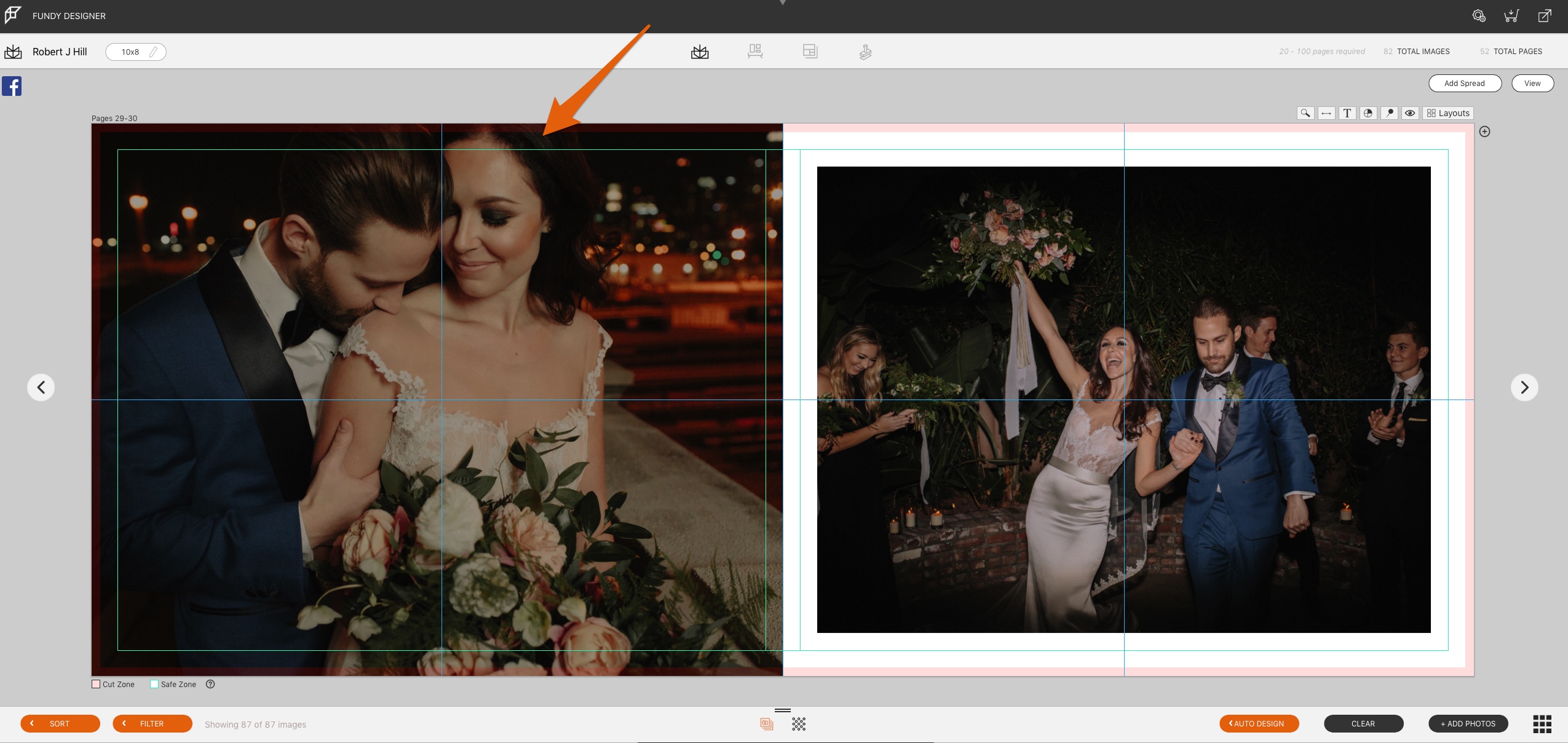
#1 Not Understanding The Safe Zone
This design element is key to making sure that your album looks like you intend after it’s printed. The safe zone is the area of your page that is ‘safe’ to place important elements; this is the area of the paper that is not going to be cut or trimmed by the album company. If you place an image with edges that extend beyond the safe zone, you risk losing some of the images when the paper is cut after printing. Album companies also cannot guarantee where the image will line up if it’s stuck in no man’s land between the safe zone and the cut line. In the example above, notice that part of the bride’s forehead will likely be cut off, which would impact the design.
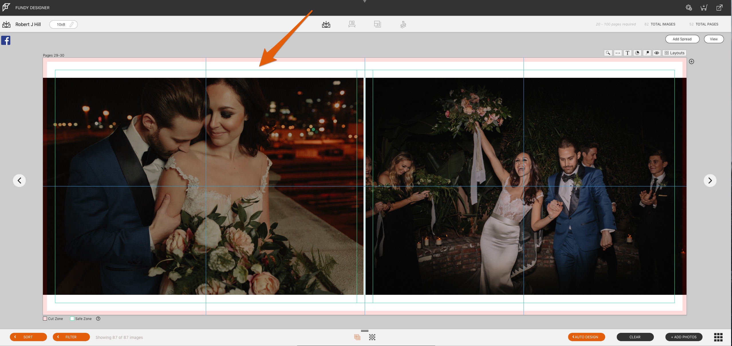
It is safer to always have important elements of your images within the safe zone. Some photos will work as full bleeds, and some will not. In this case, it’s much smarter to have the bride’s forehead included within the safe zone. So, be mindful of your safe zone and keep your important images, or image elements, within the safe zone.
#2 Consistency in Tones
A client will always notice when something looks out of place, and they will always ask for that to be changed or removed. A glaring example of this could be a page with 4 black and white images and one color image. Chances are that during the album approval process your client will ask to have that color image switched out.
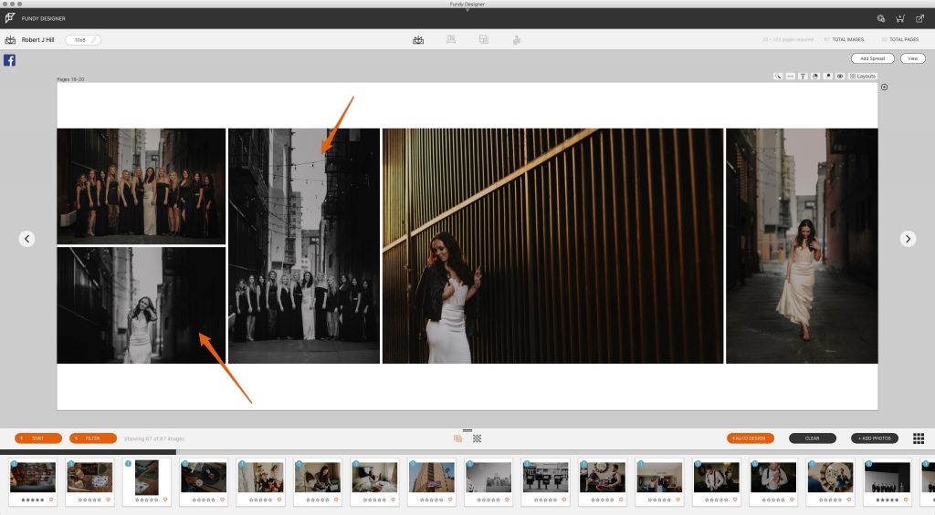
The same would likely happen if it was several color images and one black and white. A key element to good album design is to keep your tones consistent across pages, so if you are using color, stick with color. Don’t mix and match tones; this sticks out to clients and not in a good way.
This also goes way beyond just mixing color and black and white. It is also important to not mix different color processing styles, that is also an eye sore. You want your pages to look and feel consistent, the images you have on a page together should look like they belong together, be that in coloring, toning, and even emotion and framing.

#3 Over Designing
Surely as a photographer, you have had those times when you went to town on an image and after letting it sit for a while you realized that you over-processed it. Maybe you have seen images and just thought to yourself that it was over-processed. Well, this can and does happen in the design process as well.
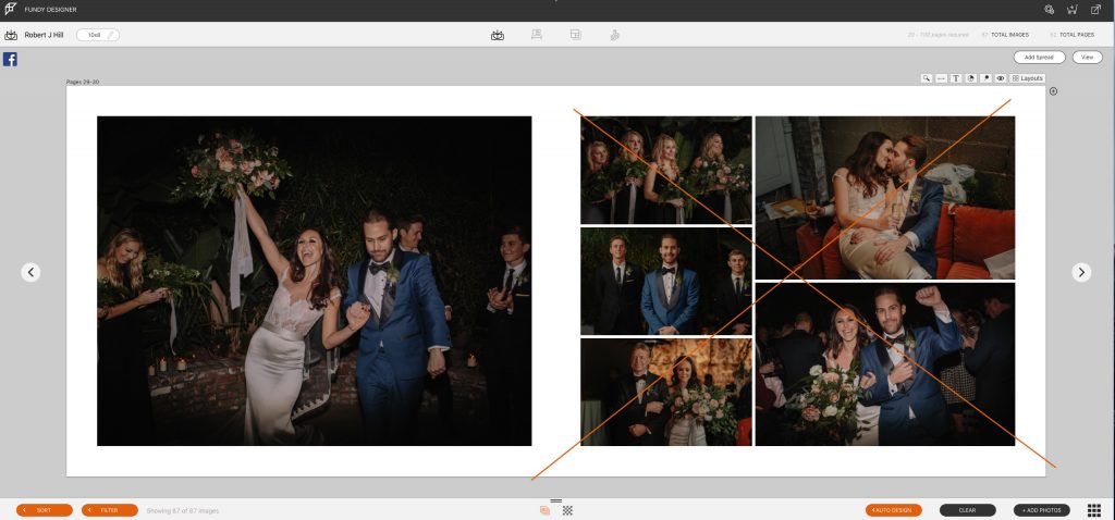
Over designing an album is bad for many reasons, but chief among them is that it gives your client more elements to request changes on, and in addition to being more work on the front end, it creates more work for you on the back end.
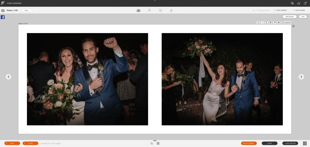
But this isn’t about saving time because you don’t want to work on an album design, it’s also about creating a timeless album that your clients can love for the rest of their lives. Rather than overwhelming your clients with ten images on one spread, which may make them want to get up close and request changes to each of those photos, we recommend staying with clean and simple designs. These elegant designs are timeless and leave the clients responding emotionally rather than logically.
Interested to learn more about album design do’s and don’ts? Discover more in this ShootDotEdit article. Click here to access our expert design tips.
If you haven’t tried the newest version of Fundy Designer with more power than ever download the free trial.
