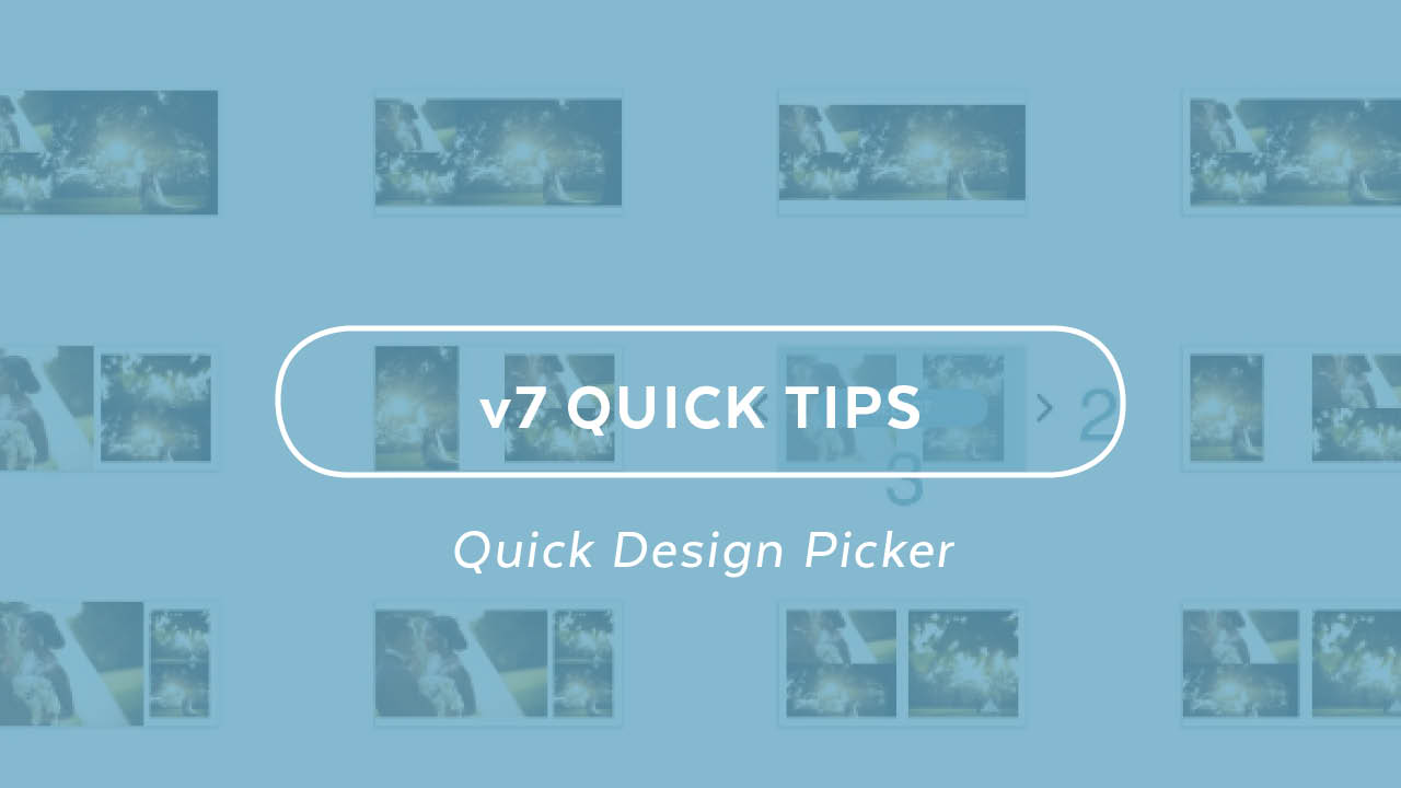
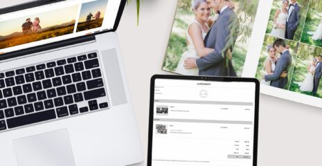
Under the hood, the Quick Design Picker® is one of the most powerful automated layout tools in the world. When you first open it, you might think you’re viewing templates, but after using it for a while, you quickly realize that we are automatically generating beautiful designs based on your images – and that is key. Whereas templates force your images into a design, the Quick Design Picker is designing around your images – placing your photography first. With v7, we’re bringing you more than 150 new options in the Quick Design Picker.
Basic Controls
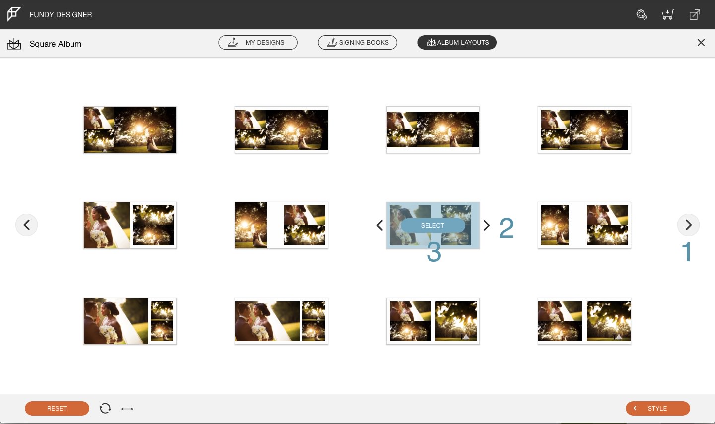
Without even knowing how the Quick Design Picker works, you can jump in and have access to more than 100 different layout options, based on more than a million different combinations. The large arrows (labeled 1 in this graphic) will cycle you through different layouts for all of our design concepts. If you see a layout that you like (for example a full bleed on the left and accent images on the right), but want to see more options within that concept, use the smaller arrows (labeled 2 in this graphic). Finally, once you have a layout that you like, just hover over it and click the select button.
Advanced Style Controls (over-riding image ratios)
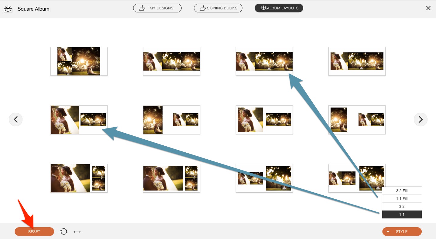
Within each design concept we have a number of controls that can override what the Quick Design Picker produces. By default, it will give you designs that stretch the image boxes to fill the allotted area on the page. This often gives a more even design aesthetic. But, this will also often crop your images in non-traditional formats. If you are a stickler for having control over your crops, this is where you want to look.
The bottom two options are quite clear. They will constrain all accent images to either 3:2 or 1:1. The top two options will design the spreads with with either 3:2 or 1:1 ratios and then stretch the image openings to fill the area. Personally, I find this option useful when the 3:2 or 1:1 crops almost fill the area, but need just a little bit of help.
To reset your choices, use the RESET button bottom left.
Shuffling Images
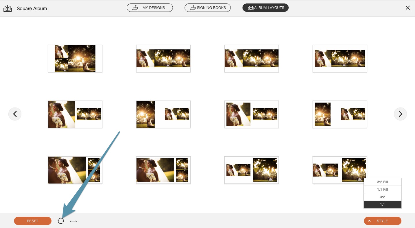
You might wonder why you only see only 100 design options when we say there are over a million possible combinations. That is where the shuffle button comes into play.
Imagine four images on one side of the page. It’s possible to have all squares, all verticals, a mix of verticals and horizontals, etc. Minimum with just that combination there are more than 16 different possibilities. Now give the ability to flip the design, add more images, etc., and the possible combinations shoot through the roof. So every time you hit the shuffle button you are given more than 100 slightly new variations to your design.
Flip Your Design
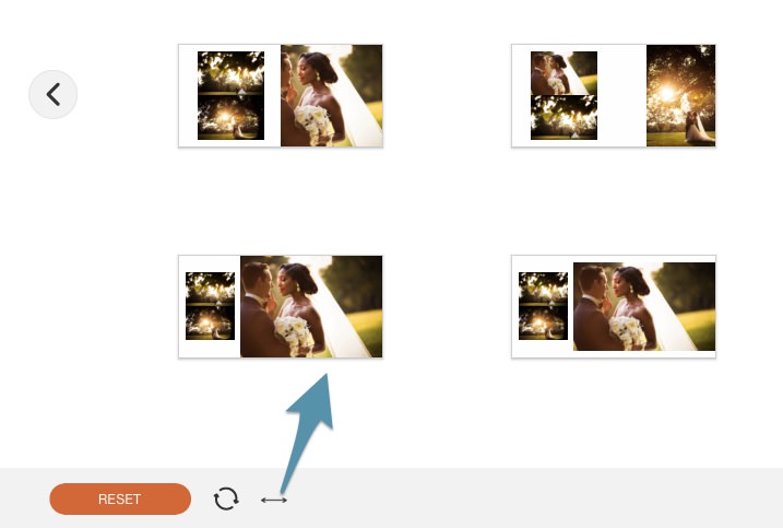
You’ll notice that all of your main images are on the left side when you open the Quick Design Picker. By clicking the flip icon you can move all of the main images to the right side of the spread. Note that we are moving the Drop Zones to opposite sides of the spread. So if a design has only one Drop Zone (such as the designs at the top of the Quick Design Picker), then it won’t be flipped.
Signing Book Designs and My Designs
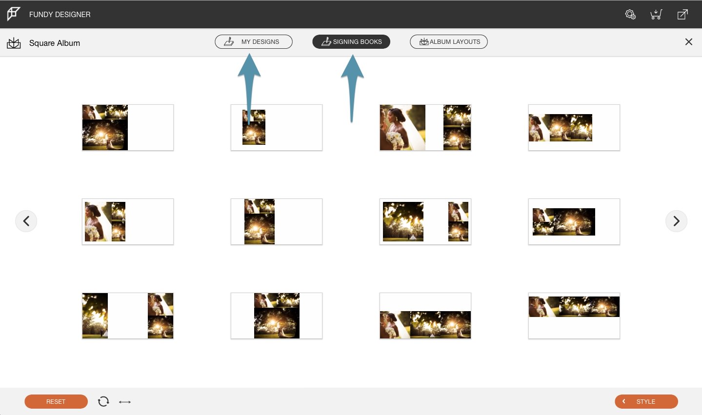
Up top you can switch your view to see Signing Book Designs as well as your own designs that you may have pinned (saved to replicate later). *Note that “My Designs” do not have multiple options to page through or style options as we replicate all settings you may have made to the Drop Zones.
Get Designing
We hope that this helps you to get more control, more quickly when designing your albums. And remember, the Quick Design Picker works much the same in our other modules, so have some fun, work fast and work like a professional.
Thank you Susan Stripling and The Wedding School for these images.
